
The 2022 Color of the Year Is (Drumroll, Please)…Kinda Purple?
“Veri Peri,” a purplish-gray-blue periwinkle, is Pantone’s pick as color of the year.
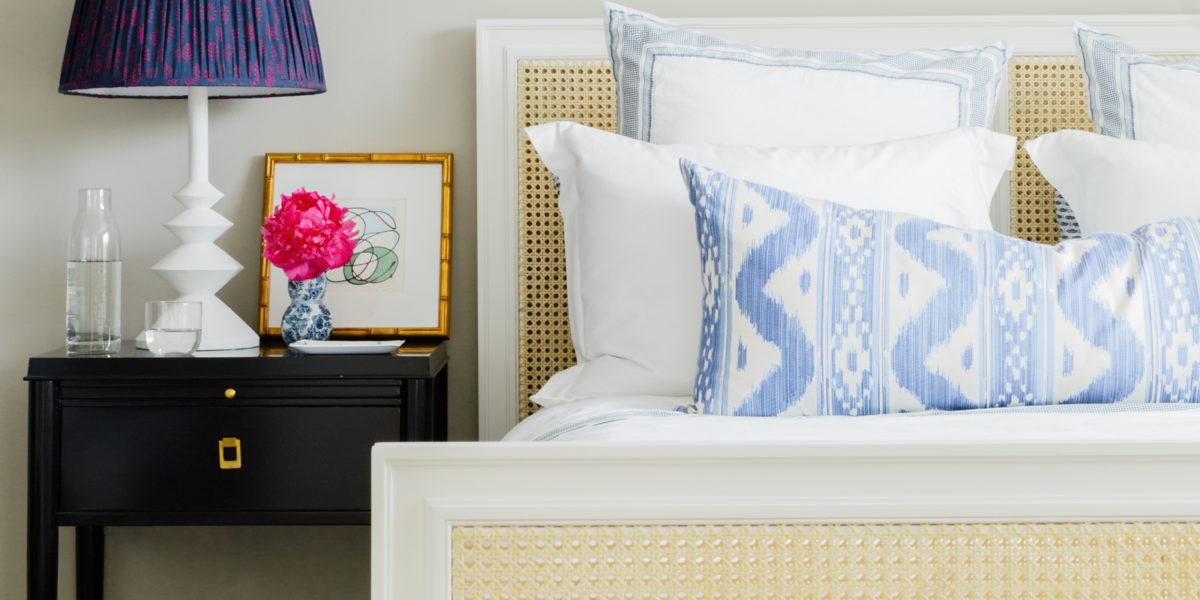
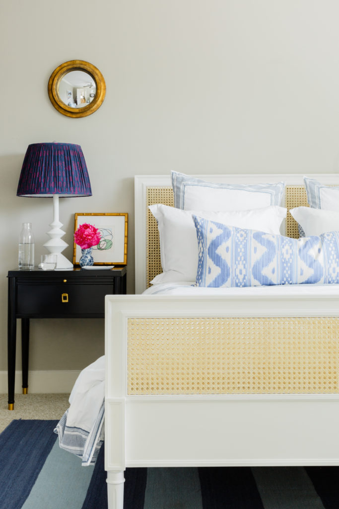
Courtesy of Paloma Contreras
A periwinkle-tinged bedroom by designer Paloma Contreras
Periwinkle the plant, also known as myrtle, is a fast-growing ground cover. It’s a European native that produces dainty, cheerful, poisonous, blue-violet flowers. Periwinkle the crayon was introduced to the original eight-pack of Crayola colors in a group of 40 new shades back in 1949. Periwinkle the word is actually very fun to say, and should replace “cheese” as the go-to smile cue for pictures. Periwinkle the color, which is gray-blue with a dash of red—and reads quite purple—can be tricky to use in interior design.
But it’s Pantone‘s pick as color of the year; more specifically, Veri Peri 17-3938 is Pantone’s 2022 color of the year, so we’ll give it a go.
Annie Schlechter
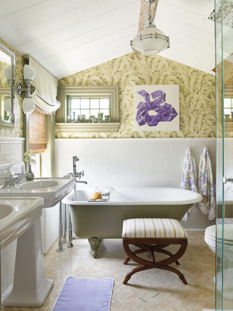
Here’s what Pantone has to say about its choice: “Blending the faithfulness and constancy of blue with the energy and excitement of red, this happiest and warmest of all the blue hues introduces an empowering mix of newness.” It was chosen for its “daring curiosity that animates our creative spirit,” and was at least somewhat inspired by the digital world—and the looming presence of the “metaverse” vision of the future, in which we don’t worry about doing things in nature, or even leaving our houses. Just kidding! Sort of. Designer Philip Mitchell, who used periwinkle accents in a cottage bathroom remodel, says that he finds the color “soothing and stimulating, whimsical and serene.”
More Videos From Sunset
There are easy, fun ways to incorporate this unusual color into your home design that are lower commitment than, say, buying a purple stove. Though no judgement from us if you want to swing big!
Try some colorful, dramatic art, vibrant new bedding, a fun and feminine rug, or a splash of purple-tinged pattern on your table. It’s a not-so-serious shade, and potentially very soothing, and we could all use a little of that right now.
Here are some of our favorite ways to experiment with the color.
Perk up Your Table
These renewable, washable, round placemats from Chilewich, in the “wildflower” color way, are easy on the earth and the eyes.
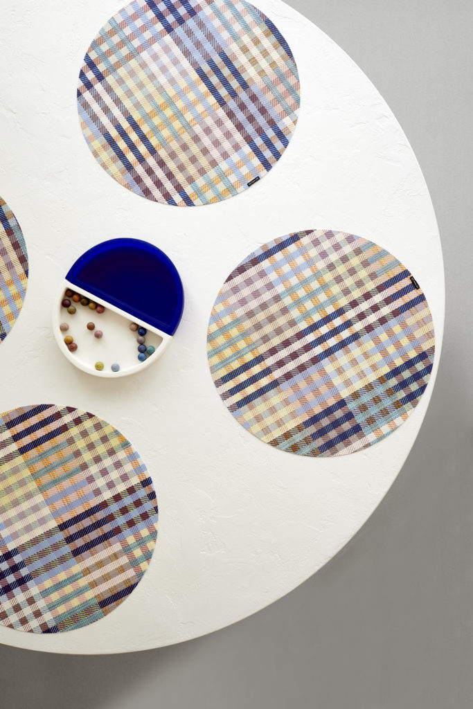
Courtesy of Chilewich
Punch up Your Sheet Game
Brooklinen’s “bluestone” sheets have periwinkle personality, and can liven up a minimal bedroom.
Work It Into Your Art Collection
The Me Home collection in Oklahoma City has bold and affordable art for sale that incorporates bright blue and purples in modern, beautiful ways.
Start from the Ground Up
Dallas-based Caitlin Wilson design is a proponent of periwinkle. Her Instagram feed is awash with shades of cobalt and violet. And her rug collection, for sale through her website, speaks to her affinity for the shade.
Play with Accent Colors
Somewhere between sapphire and French blue, with a little dash of pink, periwinkle is a shade that makes everything around it come to life. Try a few crisp, white pillows with a periwinkle pattern, inspired by this Paloma Contreras-designed bedroom in Houston, for a fresh take. This lumbar pillow from Juliska at Olive LA has a similar vibe.
Courtesy of Paloma Contreras